Once the first cut was done all the footage was laid out in the required order, the second cut was for adding all the effects and animations to make the video more visually pleasing. While shooting we relied on the sunlight as our main source of lighting and since the shoot took place over three shooting days with varying levels of light on certain scenes, this lead to some unpleasing discoloration to certain sections of the footage where the camera picked up odd muddy tones instead of the vibrant primary colours.

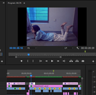
In this first half of colour correction Mahnoor basically tried to match all the footage to a equal level of brightness and correct all the discoloration and try to match them on intensity and saturation of colour as well. In the image above you can see her correcting the dull greenish hues on the original video to a the required soft vibrant yellow. She wanted to match all the colours so when she would further apply filters there would be no miss match.

After basic colour corrections she moved on to text decoration, since the text placement had already been done in the first cut in the second cut she simply added the required fonts and colours.

She did the same process with the the subtitles in the silent phone scene. Mahnoor stuck with 8-bit, retro aesthetic when using fonts. She used mostly pixelated fonts to fit the category but several variations were used to have different structures so that all the text did not look the same and still conveyed a sense of diversity.
Staying in line with the retro aesthetic, she initially planned to have the music video have a 8mm look, to do so she searched YouTube for tutorials and managed to execute the procedure and apply it on our music video. She used the stock footage provided on this website. Once downloaded she selected one of the loops provided on the same video and cut it out.

Than she proceeded to copy paste the same loop several times on a top layer above the video as seen on the time line above (without the reel sound), leaving only the intro title card sequence without an effect.

But before she copy pasted the loop she added the effects beforehand. Mahnoor increased the scale of the video so the slightly slanting borders present in the original would not appear. She then set the blend mode of the video to soft light so the 8mm fog and scratches could be applied onto the video giving it that retro feel.

To bring the 8mm look together she needed to get the aspect ratio right and give it the 4:3 square-ish box look. In order to do that she added a adjustment layer on top of the regions she wanted cropped in the required aspect ratio, However the sequences with the red phone and the break up were left out because they did not have any music playing in the background and I wanted the proper retro look to be only applied on the performance and conceptual sequences to give it a more focused and enclosed look and give the non musical parts a more traditional film like viewing on a much larger modern aspect ratio.
With the adjustment layers placed, she used the crop effect from the effects section and applied it on to the adjustment layers. On the image above you can also see the details of the effects. she used a 13% crop on both left and right sides of the video.

In the second half of colour correction Mahnoor wanted to add distinct sharp saturated filters on the videos to make the video look more richer. She played around with the Highlight, Mid tones and Shadows of each background colour sequence. She edited to make the unnatural paleness on the protagonist's face in the red silent scenes to go away and give her a more warm look while also making the background colour more prominent as seen in the screenshot above.

Since there were in total, four background colours, a floral back drop and a residence location I individually gave each section a distinctly coloured look by varying the high, mid and shadow tones.
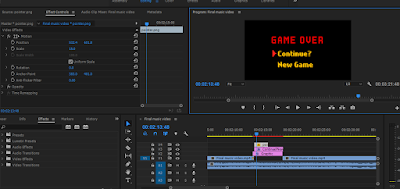
The first thing Mahnoor worked on was fixing the turning point where the emotional state of the protagonist changes and she gets back up to free herself from the thoughts of the breakup.
In the first cut there was some unclarity to how it would be animated but than we decided upon a game over title screen to effectively convey the change and new out look of the protagonist.
Note by Mahnoor:
(in case you are wondering to why some of the timelines look suddenly less crowded is because a few of the animation elements I added were on a separate project where I exported the Music video as whole and worked on top of it and used upper layers while adding elements. The original project look a very long time to render everything and my laptop at times became very overwhelmed and on a occasion premier pro crashed. Plus the final project was much faster to export as video and did not have to take up 2 hrs.)

She started by adding a random blocks transitions to cut away from the hand breaking apart signifying the couple tearing away and ending the relationship. The transition is similar a few game transition where if you fail a level or die a wipe or fade away is used to take you to the Continue/Game over Screen (like in arcade games or even older sega/nintendo/atari titles). with the transition established I began working on animating a all black game over screen.

Mahnoor started by placing down the texts and the two options given, To either "Continue" chasing after the broken relationship or "New game" and move on from it. It might be literal but it fits in well with the retro like charm of the video and the animations that we originally planned having video game like styles.

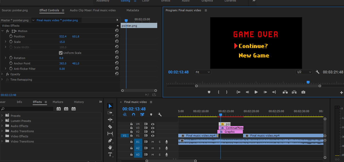
Mahnoor used a separate free drawing art program called Madi bang to draw a pointer and export it as transparent png to be used a element in the music video and animated to move on the game over screen.
Then the pointer was exported onto premier pro and resized to fit next to the two options.

While animating she wanted to make sure that she could convey a sense of decision making while animating. We did not want her to simply pick new game, instead Mahnoor made the pointer move back and forth as if she were trying to decide between moving on and finally coming to terms with it. on a occasion she even highlighted the continue? text in a slightly darker yellow colour to indicate that she might even think about continuing however in the end moves down to click new game and live on.
When animating Mahnoor gave a the pointed a small cut in the layer to give it a clicking effect where it vanishes and the new game text turns from yellow to a very brief white to green to confirm the option as a click.
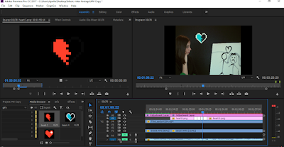
A few other small animations were added which included a pixel heart breaking similar to the pointer, the hearts were drawn separately and exported as pngs to later be animated on premier pro.
In total three images were used, a full heart, a broken heart in half and a negative of the broken heart.
the heart is shown and than a small negative broken heart frame is fitted in between the full heart and the normal coloured broken heart to convey the effect of damage being taken.

Another small effect added was the use of a censor bar png taken off google and added to the protagonist's mouth when she sings "Beep Beep" to convey the expression of her swearing in a tense stare into the camera.

Another small animated sequence included the use of pink, slightly translucent hearts with a plus next to be them being used to convey her increasing love for her work and herself during the fasted paced painting sequence.

The hearts were added in intervals and around her similar to "xp gaining" or "lvlup+" signs in some videos games as they hover above a character as they train or fight. These were added both on her mid shot and mid close up of her painting.
Lastly the one thing Mahnoor decided to change her mind about and edit to bring the whole feel and look of the music video together was animating a game start screen integrated with music video intro title screen.

She did this by using the same pointer png and moving it down with the music loop and new appearing text. However just before the third loop starts she displayed the "start game" text before hand so she could animate a similar white to green confirmation click as the third loop starts. She moved the sad production text in the corner of the screen to imitate copyright text on video game title screens with their respective years of release.

One of the last moment things she added was low muffled speech onto the silent red telephone scene after a little bit of feed back during the editing phase that the sequence was awfully silent and eerie. so she took a microphone attached it to my laptop and tried to do a voice over of someone talking over the phone. Mahnoor tried to talk in a very low pitched monotone voice slightly covering the mic to give the telephone effect. On the internet she could not find mumbled telephone speech that was not cartoonish in it's nature therefore she had to improvise.
The Second Cut Video:


In this first half of colour correction Mahnoor basically tried to match all the footage to a equal level of brightness and correct all the discoloration and try to match them on intensity and saturation of colour as well. In the image above you can see her correcting the dull greenish hues on the original video to a the required soft vibrant yellow. She wanted to match all the colours so when she would further apply filters there would be no miss match.

After basic colour corrections she moved on to text decoration, since the text placement had already been done in the first cut in the second cut she simply added the required fonts and colours.

She did the same process with the the subtitles in the silent phone scene. Mahnoor stuck with 8-bit, retro aesthetic when using fonts. She used mostly pixelated fonts to fit the category but several variations were used to have different structures so that all the text did not look the same and still conveyed a sense of diversity.
Staying in line with the retro aesthetic, she initially planned to have the music video have a 8mm look, to do so she searched YouTube for tutorials and managed to execute the procedure and apply it on our music video. She used the stock footage provided on this website. Once downloaded she selected one of the loops provided on the same video and cut it out.

Than she proceeded to copy paste the same loop several times on a top layer above the video as seen on the time line above (without the reel sound), leaving only the intro title card sequence without an effect.

But before she copy pasted the loop she added the effects beforehand. Mahnoor increased the scale of the video so the slightly slanting borders present in the original would not appear. She then set the blend mode of the video to soft light so the 8mm fog and scratches could be applied onto the video giving it that retro feel.

To bring the 8mm look together she needed to get the aspect ratio right and give it the 4:3 square-ish box look. In order to do that she added a adjustment layer on top of the regions she wanted cropped in the required aspect ratio, However the sequences with the red phone and the break up were left out because they did not have any music playing in the background and I wanted the proper retro look to be only applied on the performance and conceptual sequences to give it a more focused and enclosed look and give the non musical parts a more traditional film like viewing on a much larger modern aspect ratio.
With the adjustment layers placed, she used the crop effect from the effects section and applied it on to the adjustment layers. On the image above you can also see the details of the effects. she used a 13% crop on both left and right sides of the video.

In the second half of colour correction Mahnoor wanted to add distinct sharp saturated filters on the videos to make the video look more richer. She played around with the Highlight, Mid tones and Shadows of each background colour sequence. She edited to make the unnatural paleness on the protagonist's face in the red silent scenes to go away and give her a more warm look while also making the background colour more prominent as seen in the screenshot above.


Once she was happy with each look she simply copy pasted the filter effect each onto their respective colour coordinated video. She also did vary the looks of the red telephone scenes with no music and the performance scenes with the red background to compliment the difference of the aspect ratio.
Once all the visual editing was done and the music video began to look nice she moved on to adding the animation elements to give the video a more lively feel and filling out the bland emptiness.
In the first cut there was some unclarity to how it would be animated but than we decided upon a game over title screen to effectively convey the change and new out look of the protagonist.
Note by Mahnoor:
(in case you are wondering to why some of the timelines look suddenly less crowded is because a few of the animation elements I added were on a separate project where I exported the Music video as whole and worked on top of it and used upper layers while adding elements. The original project look a very long time to render everything and my laptop at times became very overwhelmed and on a occasion premier pro crashed. Plus the final project was much faster to export as video and did not have to take up 2 hrs.)
She started by adding a random blocks transitions to cut away from the hand breaking apart signifying the couple tearing away and ending the relationship. The transition is similar a few game transition where if you fail a level or die a wipe or fade away is used to take you to the Continue/Game over Screen (like in arcade games or even older sega/nintendo/atari titles). with the transition established I began working on animating a all black game over screen.


While animating she wanted to make sure that she could convey a sense of decision making while animating. We did not want her to simply pick new game, instead Mahnoor made the pointer move back and forth as if she were trying to decide between moving on and finally coming to terms with it. on a occasion she even highlighted the continue? text in a slightly darker yellow colour to indicate that she might even think about continuing however in the end moves down to click new game and live on.
When animating Mahnoor gave a the pointed a small cut in the layer to give it a clicking effect where it vanishes and the new game text turns from yellow to a very brief white to green to confirm the option as a click.

 |
| drawing under process |
 |
| turning the broken heart negative |
the heart is shown and than a small negative broken heart frame is fitted in between the full heart and the normal coloured broken heart to convey the effect of damage being taken.


Lastly the one thing Mahnoor decided to change her mind about and edit to bring the whole feel and look of the music video together was animating a game start screen integrated with music video intro title screen.

She did this by using the same pointer png and moving it down with the music loop and new appearing text. However just before the third loop starts she displayed the "start game" text before hand so she could animate a similar white to green confirmation click as the third loop starts. She moved the sad production text in the corner of the screen to imitate copyright text on video game title screens with their respective years of release.

One of the last moment things she added was low muffled speech onto the silent red telephone scene after a little bit of feed back during the editing phase that the sequence was awfully silent and eerie. so she took a microphone attached it to my laptop and tried to do a voice over of someone talking over the phone. Mahnoor tried to talk in a very low pitched monotone voice slightly covering the mic to give the telephone effect. On the internet she could not find mumbled telephone speech that was not cartoonish in it's nature therefore she had to improvise.
The Second Cut Video:
SYMBOLISM:
Retro Games
In the music video we've used retro 80's games layout and themes in various place to build meaning. When the music video starts it says start game. When shes rached her lowest point the game ends and she has the option to either continue or start a new game. She after some hesitance chooses new game, which contextually means that she's setting off onto the path of moving on and accepting herself.

This theme is continued within the music video with the use of animation. When her heart is broken and she's miserable the heart halfs, almost like an energy bar. At the end when she's moved on and is now a balanced person, the heart is full once more. When she's painting what will come to represent her finding herself, we see more tiny pink hearts with plus symbols, acting as gaining points like in retro games.

Audio
An important addition to the second cut is some audio Mahnoor recorded to match the lover's words when they're breaking up with her. The absolute dead indifference she managed to put into the recording builds the meaning and hints at how one-sided their relationship really was, also hinted at by the blank face of the boy in her earlier painting.

'Censored'
By censoring her mouth when the lyrics "Beep Beep" can be heard we raid and reconstruct (John Stewart) the meaning of the lyrics from the ringing of a phone to her swearing at her ex.

Comments
Post a Comment