Though we all gave her input and went over various options and versions together, Mahum was the one who actually constructed the website.
She created it from scratch, starting off with a blank template. The team looked at existing websites of renowned artist, in order to find out the codes and conventions existing in websites (Website Analysis). Following this, Mahum looked at different templates on wix to get a better idea of the options available on the platform. Understanding the Website Editor was a little tricky for her but she managed to do it.
For the menu page she did not want to add alot of things, inspired by the minimalist styles some indie websites are using.She wanted to keep it simple. She added a menu bar, customized it to her liking in accordance to the colour scheme that we had decided and above that added our Logo designed by Mahnoor. On the top right she added a sign in button customized with our decided colour scheme and on the top left she added all the social media icons that will connect the audience to those social media pages. Example: Facebook, Instagram,YouTube and twitter.
For the home page we had decided to post our video there. After putting the video the page looked a little empty so Mahnoor decided to make a GIF for the home page that would advertise the album and with that Mahum added the digipack inlay and cover designed by me to publicize our product more.
Then comes the 'News' page so in this page. Mahum added an interview with the RedTide Rats, which was written by me, a live twitter stream and a live Instagram feed (created by me and Mahum respectively) to keep our audience updated with The RedTide Rats. We had accounts on Instagram Facebook Twitter and YouTube but wix was only offering live feed from Instagram and Twitter. We would have liked one for Facebook as well but we made do with what we had.
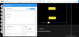
For The Live shows page Mahum added a live calendar with all the upcoming events. She customized all the buttons and the calendar with our colour scheme. Above that she added one of our show posters, made by Mahnoor on Photoshop, and a picture of The RedTide Rats. I added the shows till September so even if the Calendar keeps updating the shows don't end.
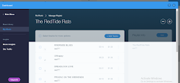
The second last one is music. Here she added a music stream. She also added dummy audios with all the song names by the RedTide Rats instead of just putting up a playlist to make the album seem playable, an option in most indie websites since they're looking for more traction. Before the stream she had to make her own playlist as well. She customized the stream with our color scheme and above that she added our music video, connected to YouTube.
Lastly we have the sign up page. The sign up box is customized with our color scheme. The font of the website is Nokia cellphone, 8 bit pusab and Dreamover. we have used it in our digipak as well so we decided to use it in the website as well.
She created it from scratch, starting off with a blank template. The team looked at existing websites of renowned artist, in order to find out the codes and conventions existing in websites (Website Analysis). Following this, Mahum looked at different templates on wix to get a better idea of the options available on the platform. Understanding the Website Editor was a little tricky for her but she managed to do it.
For the menu page she did not want to add alot of things, inspired by the minimalist styles some indie websites are using.She wanted to keep it simple. She added a menu bar, customized it to her liking in accordance to the colour scheme that we had decided and above that added our Logo designed by Mahnoor. On the top right she added a sign in button customized with our decided colour scheme and on the top left she added all the social media icons that will connect the audience to those social media pages. Example: Facebook, Instagram,YouTube and twitter.
Next page is 'The Artist'. We really liked wix because of all the options it offered. For the artist page she decided to put up a slide show of the artist's pictures with a little introduction under it, written by me. Instead of a gallery page we thought this was a better idea since it was more easily accessible, something the new-tech age consistently looks for. She made sure everything on this page was according to our colour scheme.
Next up we had the shop. We added our merchandise as well. 2 T-shirts, A medium Poster and a compact disc, designed by Mahnoor with the help of Photoshop. Mahum added them and the "Buy" buttons under it and customized them according to our color scheme: red and white the details with yellow and the heading with blue.
For The Live shows page Mahum added a live calendar with all the upcoming events. She customized all the buttons and the calendar with our colour scheme. Above that she added one of our show posters, made by Mahnoor on Photoshop, and a picture of The RedTide Rats. I added the shows till September so even if the Calendar keeps updating the shows don't end.
The second last one is music. Here she added a music stream. She also added dummy audios with all the song names by the RedTide Rats instead of just putting up a playlist to make the album seem playable, an option in most indie websites since they're looking for more traction. Before the stream she had to make her own playlist as well. She customized the stream with our color scheme and above that she added our music video, connected to YouTube.
Lastly we have the sign up page. The sign up box is customized with our color scheme. The font of the website is Nokia cellphone, 8 bit pusab and Dreamover. we have used it in our digipak as well so we decided to use it in the website as well.
Here is a link to our website: https://sadthree10.wixsite.com/website


Comments
Post a Comment