
Digipak: Inlay (Final Draft)

The inlay too went through our scrutiny and we decided to make some changes while retaining many elements.

First Page

The heart now on the front cover, we decided to put the image of the artist on the first page of the inlay, a convention in digipaks. We retained the background and its texture, framing the image of the artist.


Mahnoor then edited the background of the image, using the magic wand tool to select the background, copying that layer. colouring it black and then placing it on top of the original image.  She then another texture picked up from the website Transparent Textures.


The next step was to add the copy rights and the transparent versions of the logos on the bottom of the page as they were before (see Digipak: Inlay (First Draft)).
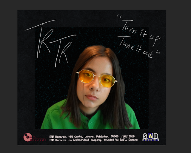

Next Mahnoor, used her drawing tablet and a size 3 PS brush to make the artist's signature and to write the quote. We wanted the signature and quote to seem as natural as possible which is why we used this method. Once opened on the Photoshop file, the typography was adjusted with the help of the move tool and the transformation tool ( Ctrl + T + Shift to preserve proportions).


This is what the refined first page looks like:


Second Page

We retained the blue background and it's texture in the second page. However we ended up scrapping the painting as the CD, since following our theme of flat colours, we thought a plain CD would look better and more cohesive. We, chose yellow as the predominant colour of the CD as it represents joy, something the listeners will be experiencing once they listen to the music. We also added a red inner circle with the help of the ellipse tool, the red representing passion and the underlying negative feelings of the artists.


We changed the colour to a brighter red according to the colour scheme and used the pixelation tool to pixelated the red, to match the pixelation theme we've been following. The red portion was then transformed (Ctrl + T + Shift to preserve propotrions) to adjust it's size. All the elements were then centralised and a png indicating that this is a CD was added.


This is what the refined second page with the CD looks like:


Comments

Popular posts from this blog

Second Cut (Final Music Video)

Once the first cut was done all the footage was laid out in the required order, the second cut was for adding all the effects and animations to make the video more visually pleasing. While shooting we relied on the sunlight as our main source of lighting and since the shoot took place over three shooting days with varying levels of light on certain scenes, this lead to some unpleasing discoloration to certain sections of the footage where the camera picked up odd muddy tones instead of the vibrant primary colours. In this first half of colour correction Mahnoor basically tried to match all the footage to a equal level of brightness and correct all the discoloration and try to match them on intensity and saturation of colour as well. In the image above you can see her correcting the dull greenish hues on the original video to a the required soft vibrant yellow. She wanted to match all the colours so when she would further apply filters there would be no miss match. After basi...

Creative Critical Reflection

Now that we've wrapped up our advanced portfolio its time to reflect on our project through the focus of certain questions. Q.1 How do your products use or challenge conventions and how do the represent social groups or issues? The genre me and my team picked for our final products was indie pop. Indie as a genre in general breaks tonnes of conventions and creates new ones mostly due to the freedom allotted to the artists. Rather than having set conventions the indie scene works in trends which emerge with time, which is what we've based certain aspects of our products off and what we've gone against to showcase some of our own artistic ability. In a country like Pakistan, which is mostly over run with remastered coke studio versions of old songs, releasing an indie pop album and music video is unconventional as it is. Similarly, due to the creative freedom the genre allows us, we were able to represent social issues which we may not have been able to if we were to be...

Website (Final)

Though we all gave her input and went over various options and versions together, Mahum was the one who actually constructed the website. She created it from scratch, starting off with a blank template. The team  looked at existing websites of renowned artist, in order to find out the  codes and conventions  existing in websites (Website Analysis). Following this, Mahum looked at different templates on wix to get a better idea of the options available on the platform. Understanding the Website Editor was a little tricky for her but she managed to do it.  For the menu page she did not want to add alot of things, inspired by the minimalist styles some indie websites are using.She wanted to  keep it simple. She added a menu bar, customized it to her liking in accordance to the colour scheme that we had decided and above that added our Logo designed by Mahnoor. On the top right she added a sign in button customized with our decided colour scheme  and on th...