Once we were done with the first draft, we gathered once more to review the digipak as a team along with our Media Sir. We decided that though the painting was a good aspect to build a brand off of, it did not have as much screen time or relevance for us to justify designing the entire digipak off of it. Instead we decided to use a more pop artish modern feel to the digipak. We retained major elements of the digipak but greatly transformed what it looks like.


Front Cover
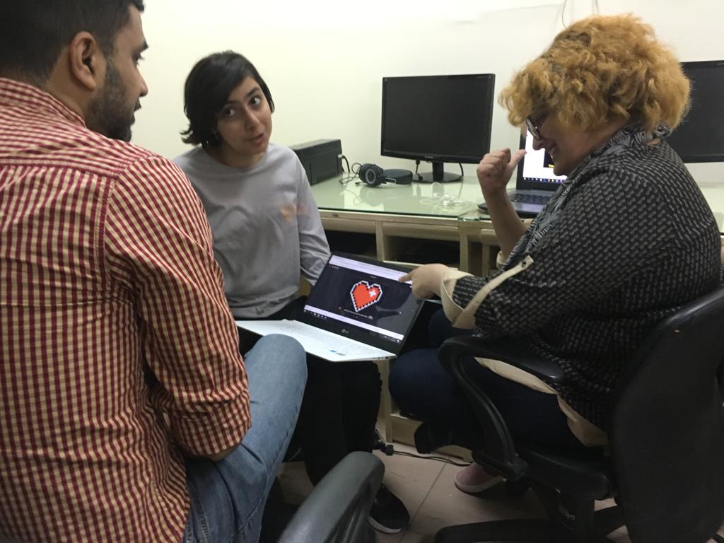
The pixelated heart and the pixelated theme in general plays a huge role in our music video. This added with the fact that both pop art and minimalism is quite in with indie artists, we decided to convert the first inlay page into the front cover. We also felt it was important to have the background be black as that was the colour where her creativity hits her full force as well as the manifestations of her various emotional states. We did this by opening the inlay 1 file and removing elements such as the copyrights and the record label and production company's logo. The texture in the background was retained. Then we added the title and the name in the same fonts and colours that we chose at first (see Digipak: Front Cover (First Draft) for symbolic meaning.


This is what our refined front cover looked like at last:


Back Cover
For the back cover we decided to use the same background as the second page as the inlay, since it has the modern vibe we're going for and creates a sense of continuity. We also decided it would be better to continue the theme of flat colours since it is heavily propogated in our music video. The title 'Tracklist' and the track list were added in the same font as we had previously selected. The happy in 'UNhappy' was left uncapitalised to emphasis the UN part of the song title. The colour red was used for the track list as its the colour that represents passion, which is exactly what these tracks contain. The title itself is in white, as to stand out against the deep blue of the background.

The next step was to add the copy rights. We retained the font but changed the font colour to white so it stands out against the deep blue of the background. We also added the logo and the transparent version of the record label logo (also made on Photoshop) in the same positions as before since they are essential elements.


We thought it would be better to place the copyrights at the bottom, since there's no artistic element that needs to be perserved unlike in the first draft and hence there is no need to break convention.

This is what our refined back cover looked like at last:

Spine:
We decided to incorporate elements from both the front cover (the black colour) and the back cover (the white text) on the spine. I started off by inputting the dimensions (4.95 inches height and 0.25 inches depth, acting as the width in this case). We coloured the spine black and added the title of the album and the artist in the names in the same font as the cover with the help of the text tool. We rotated the text by transforming it (Ctrl + T), right clicking and choosing the rotate 90 degrees option.


As a finishing touch, we added the artist's logo to the spine, designed and drawn by our team mate Mahnoor. We resized and adjusted the logo with the help of the transformation tool (Ctrl +T + Shift to perserve porpotions). It was rotaed by right clicking and pressing rotate 90 degrees while it was still in transformation mode.

This is what the spine looks like:
Comments
Post a Comment